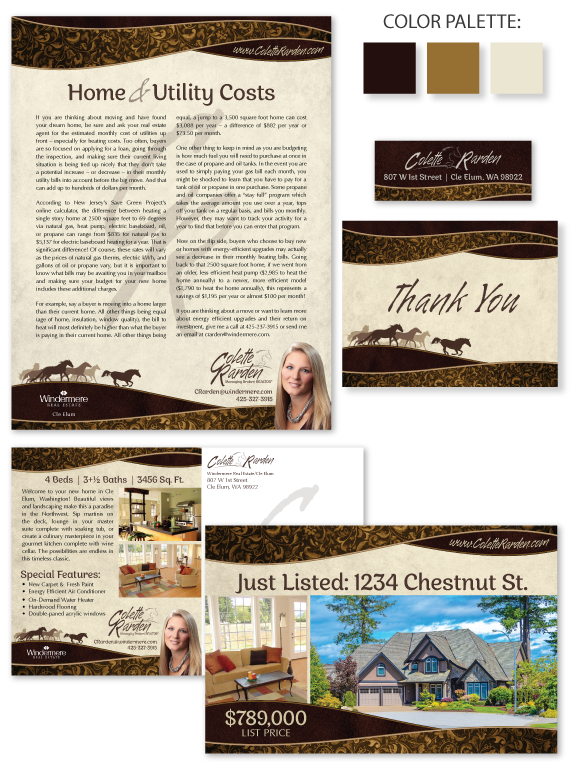
This week’s Branding Spotlight features the design of MASTERY agent Colette Rarden, from Cle Elum, Washington. Colette requested a rustic brand with luxurious accents to showcase her expertise for rural equestrian properties. The elegant curves symbolize rolling hills or a cowboy hat brim. The Western tooling pattern adds interest and provides a touch of femininity to the bold chocolate, caramel and parchment color palette. The running horses in the footer contribute provide graceful energy to the brand, and the breakaway horse leading the group symbolizes Colette’s perseverance and determination to constantly excel in accommodating her client’s goals. The brand font collection combines a rugged-edge handwritten font and a chic semi-serif font. Finally, Colette’s design is perfectly polished with a monogram watermark stylized to look like an old-west branding iron.
Want to learn how branding can make a difference in your real estate business? Call us at (360) 527-8904, email [email protected], or learn more:
![]()
 Posted in
  Tags:
Tags: