The starting point: Sarah has been working with us since 2007. So, when she decided she was ready for an up-to-date logo package, we went all in. Her former branding incorporated her love of wine, using bold vineyard imagery, and a name treatment made of parchment and grapes. This time around, she wanted more understated branding that more subtly tied in her love of wine.
The target audience: Having been in the biz for nearly 20 years, Sarah has a rich and diverse referral business. She needed a brand that bridged her professionalism with this personal connection she has with her client base.
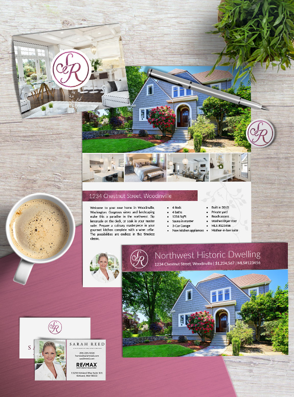
The strategy: To pair Sarah’s passion for vino with her love of minimal design, we began with a logo package, and eventually created collection of complementary marketing materials.
The final brand: The full logo features Sarah’s name in a stately serif font, followed by the perfect tagline that ties her brand together: A rich blend of real estate services. The monogram itself is styled as a beautiful stamp with intertwined letters. We polished off the design with a gorgeous red wine-colored watercolor texture, and a simple light gray vine watermark.
After working with Sarah for more than ten years, her new brand is a perfect example of how, like a fine wine, good things take time.
![]()
To talk to a branding expert and discover how branding can make a difference in your real estate business, call us at (360) 527-8904, email [email protected].
 Posted in
  Tags:
Tags: