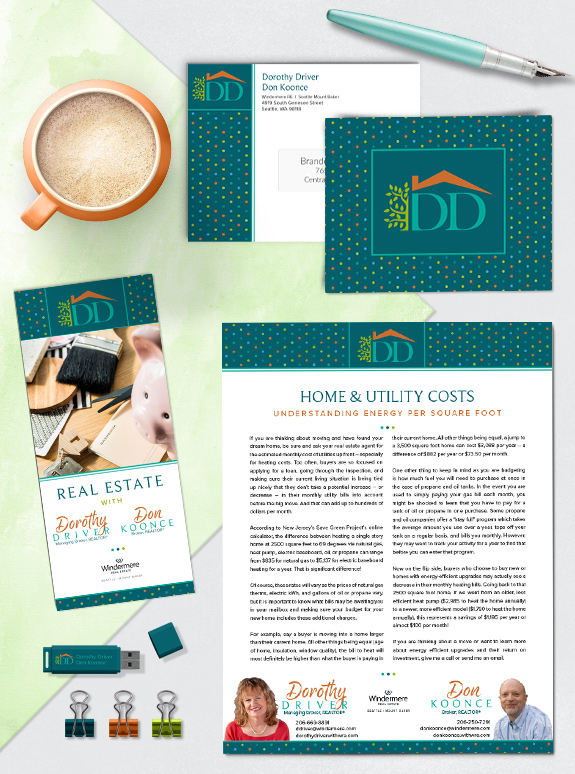
The starting point: Dorothy loves color and wanted to include all of her favorite hues in her Mastery brand. She also wanted to use dots as a major branding element, as she built brand equity with dot-patterns before. However, the final brand also needed to work well for her business partner Don and incorporate their established team logo.
The target audience: Dorothy has been in the real estate industry for over 40 years and has built an impressive database of referrals and repeat clients, including her some of her clients’ kids. With such a broad yet personal audience, she needed a brand that could convey the fun and industry expertise she brings to every relationship.
The strategy: As whimsical as dots are, Dorothy also wanted something that could easily translate into luxury marketing. To achieve that, she opted for a geometrically precise polka-dot pattern and a definitive frame around the logo. Below, we see the full color version of her brand, but she has also developed a luxurious copper-and-dark-teal variation for special occasions.
The final design: Shades of teal, orange, lime, and blue make up an eye-catching palette sprinkled over the rich teal background. A soft brush script paired with a modern serif font create approachable signatures for her and Don. Overall, her new brand is sure to be a cheery addition to every marketing piece.
![]()
To talk to a branding expert and discover how branding can make a difference in your real estate business, call us at (360) 527-8904, email [email protected].
 Posted in
  Tags:
Tags: