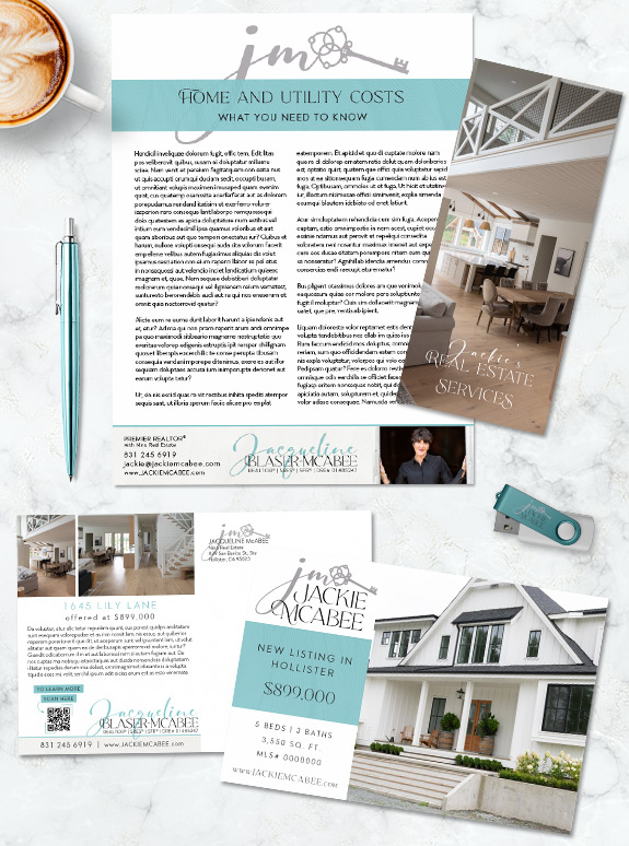
Jackie is a California agent that wanted a light and clean brand to unify her systems. With a few statement elements, we created a brand that is easy to work with while maintaining a unique presence. The light aqua, cream, and gray palette keeps everything bright. Upon closer inspection, the large blocks of color have a tone-on-tone pattern for added depth and interest. The script monogram with an old-fashioned key adds softness and keeps everything tied to real estate.
Fonts can be such a critical choice in branding—they can be like writing with an accent! Her headline font is a stately and stylish serif comes with optional swashes to make any word extra special without cluttering the space. Her script font only shows up in her logo and name treatment, but it adds a slight feminine embellishment to an otherwise austere brand. Overall, Jackie’s brand balances minimal aesthetic with her own personal flourish.
Call us at 360-527-8904 or email [email protected] today!
Curious about how your personal style can be represented in a professional brand? Book a branding consultation today!
![]()
 Posted in
  Tags:
Tags: