real estate postcards | The Zebra Blog

Posts Tagged ‘real estate postcards’

Design Spotlight: Rae Anne Catron

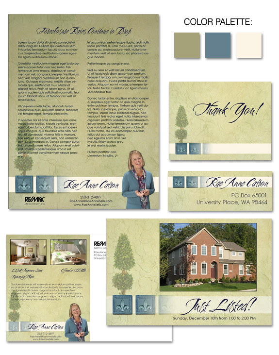
If the term “approachable elegance” comes to mind when you view Rae Anne Catron’s brand then we’ve done our job! Rae Anne has built a successful business due in part to her warm and welcoming way with clients.  It was important to her that her brand communicate this feeling to clients, while not being too […]

Design Spotlight: Stephanie Krantz

If you want to create a sense of warmth, sometimes a warm color palette is a good starting point! That’s exactly how we began working with Stephanie Krantz on her new business brand.  The rich golds and burgundies of Stephanie’s brand evoke an immediate response in the viewer … and the sunflower is sure to […]

Design Spotlight: “Colonial Dreams”

Cool as a cucumber, “Colonial Dreams” offers a serene pallete, which is an ideal backdrop on which to market not only yourself, but your sellers’ listings. Delicate scrollwork offers a subtle design touch, without distracting from the business at hand. And the secondary font and name treatment allow your style to shine! Not all parts […]

Design Spotlight: “Smooth as Silk”

“Smooth as Silk” is our latest brand – and it’s a bold one! Here, we’ve implemented a confident take on purple.  As a color, purple blends the stability of blue and the energy of red.  When used in a saturated manner as we have here, it creates a brand impact that will appeal to artistic […]

Design Spotlight: “Nocturne in Blue”

“Nocturne in Blue” is a beautiful design, with a lyrical feeling and a sense of movement. Although the brand offers multiple rich layers of detail, the design is not intrusive.  In fact, the brand has been carefully developed to provide an ideal format to showcase your business.

Design Spotlight: “Wayward Madrona”

Madrona trees are unique to the Pacific Northwest portion of the United States, and are an iconic image in that part of the country, particularly in coastal areas. We’ve based the color palette for “Wayward Madrona” on a madrona tree’s most notable feature — it’s reddish bark, which regularly peels off the trunk — and […]

Design Spotlight: “Welcome to the Northwest”

What happens when you mix rich chocolate brown, cool creamy vanilla, and a stunning backdrop of scenery? “Welcome to the Northwest”, that’s what! Washington is home to some of the most jaw-dropping scenery in the United States, and many agents who live and work in this area like to capitalize on the natural beauty in […]

Design Spotlight: “The Royal Treatment”

Instant Identity: The Royal Treatment

Historically, purple has been a color associated with nobility, power, ambition … and luxury! There’s no doubt that, for most people, purple conveys a feeling of extravagance and wealth. Are you an agent working in the luxury market?  If so, our “Royal Treatment” brand can definitely help you convey the right message to potential clients

Design Spotlight: “Evening Beach”

The palette for our newest brand, “Evening Beach”, can be described in one word — gorgeous! Or perhaps we need more words … words such as soothing, serene, and stunning. The “Evening Beach” brand features a cool-toned, nature-inspired palette which offers all the strengths of the color blue, without feeling corporate or staid.  And the […]

Design Spotlight: “Wooden Inlay”

What happens when you mix a love of wood details with a love of wine? “Wooden Inlay”, that’s what! This brand includes references to the beauty of inlaid wood design, while simultaneously tipping its hat to wine lovers everywhere! The rich palette of brown, caramel, and ecru is gender neutral, appealing to both men and […]

Awesome, timely advice for real estate agents. Delivered weekly.
  • Fresh trends
  • Best practices
  • Research and statistics

Enter your email and stay on top of things,


Subscribe!