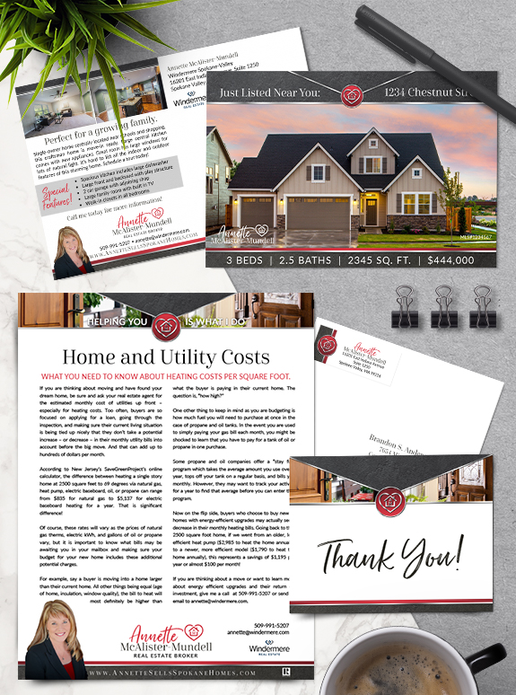
Annette found the perfect balance between her dramatic red and black palette, classic chrome trim, and down-to-earth slate textures in her new Semi-Custom PRO brand. Her monogram-heart logo, along with the open door imagery in her header, helps illustrate her love for providing all-inclusive client care. Her brand design combines a brush script font with […]
Posts Tagged ‘serif’
Branding Spotlight: Neressa Carr
Neressa Carr’s love of the Pacific Northwest coastline was the key inspiration for her new Mastery brand. Neressa chose imagery of our local coastline, beach strewn pebbles, sun-bleached driftwood, and Adirondack chairs with a view. Even the white-washed wood texture in her footer conveys the modern and easygoing Puget Sound lifestyle. Her hexagonal monogram is […]
Branding Spotlight: Sharon Engels
One of our Whatcom County neighbors, Sharon Engels, has boosted her business identity with a new Semi-Custom PRO brand. The country-lifestyle photos on her agent-marketing pieces perfectly reflect the aesthetic of her community. We used a serif font to ensure headline legibility, and a whimsical script font to add a personal touch to every piece. […]
Branding Spotlight: Ann Hoppe
Ann Hoppe naturally has a sunny disposition, and she wanted her Semi-Custom PRO brand to reflect that. Tropical blues paired with warm sand textures create a brand that is attractive and delightful to the eye. An elegant script font adds a personal touch to her name, while a strong all-caps serif makes her headlines easy […]
Branding Spotlight: Peter Cattle
Peter Cattle’s new custom brand captures his professional experience, honesty, and skills as an advisor. His logo, inspired by his last name, embodies the power of investing in real estate as well as his confidence when at the negotiation table. The gentle curved footer mimic’s the logo’s horns to carry the theme throughout the design. […]
Branding Spotlight: Gabe & Nicole Munoz
MASTERY clients Gabe and Nicole, owners of HomeCal Group brokerage and property management company in Southern California, are a great example of how effective a driven go-getter team can be. Their brand consists of a filtered southern California pathway flanked by local oak trees, with sand colors and bold, elegant fonts. During their time in […]
Branding Spotlight: Marie Strong
One of our branding super-stars, Marie Strong has a bold and classic brand that accentuates her passion for working with and preserving historical homes. From her classic font selection to the tone-on-tone pattern in the background, her brand balances vintage aesthetic with modern utility and strength. An understated structure, with slim header and footer bars, […]
Branding Spotlight: Julie Clarke
This week’s branding spotlight features the design of Mastery client Julie Clarke from Germantown, Wisconsin. Julie needed a brand that would match her flair for fun and her dedication to her clients. She embraced her favorite color–pink!–and paired it with navy and a pearly bokeh texture to keep it mature and sophisticated. The monogram seal-style […]
Branding Spotlight: Tanis & Rietta Costa
This week’s branding spotlight features the design of Mastery agents Tanis and Rietta Costa, from Marysville, Washington. This unique mother-and-son team really wanted to highlight the beautiful Cascade mountain range and emphasize their local expertise. The mountain panorama echos the mountain in their logo, but give prominence to marketing and property photos when needed. The […]