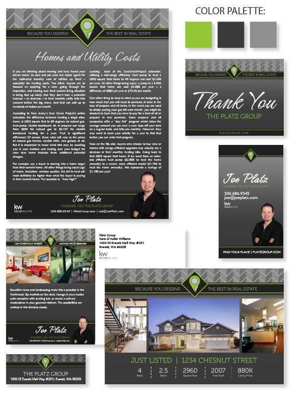
This week’s design spotlight features MASTERY agent, Joe Platz, and his real estate team known as The Platz Group. Joe is a team player and very goal oriented. His team is located among 7 offices in the in Snohomish county, Washington, and north. He wanted a brand that would be versatile, recognizable, and extendable to any market his business may serve for years to come.
This brand was designed to be consistently shared by his entire team, so the first stage of brand development focused on his logo, which combined a “P” for “Platz”, a map location pin (because his name means “place” in German), and quotation marks to symbolize his expert communication skills.The rest of his brand followed with a solid, linear structure and a strong duo-tone gray and eye-catching green color palette.
Joe selected the script font himself to add a personal touch to his marketing. The semi-serif font used for sub-headers and taglines perfectly combines readability with modern style. The repeated chevrons in the header resemble building structures, uniformity, and emphasize his passion for military-style precision in his business practices.
Want to learn how branding can make a difference in your real estate business? Call us at (360) 527-8904, email [email protected], or learn more:


 Posted in
