Everyone wants an amazing logo with their brand—it’s one of the most common requests to our design team during the branding process. There are many different styles and applications for a logo, from monogram to word-mark, emblem to icon, abstract to literal, and everything in between. Our team has created hundreds of logos, so today we’re going to take a look at three of our design team’s favorite monograms and what makes them tick.
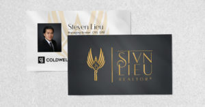
 Steven Lieu: Eagle-Key-Monogram
Steven had a concept in mind and through the branding process our team nailed it. With so many elements, it was necessary to keep the design and silhouette as simple as possible. The stylized wings and modern key teeth in the eagle’s tail combine for an overall concept that doesn’t rely on excessive detail.

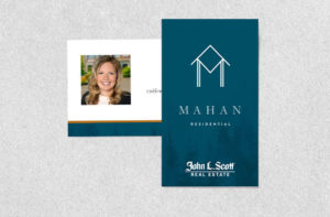
Mahan Residential: Craftsman Doorway Monogram
Caitlin Mahan didn’t have a specific vision, but she wanted something minimal and timeless for maximum versatility. The logo is built on a monogram “M” that provides the pillars of a minimal craftsman doorway. Clean and simple, it’s also reminiscent of local architecture trends.

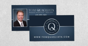
Tom Quagliata: Roofline Monogram
Tom has such a unique letter for his monogram. Using his headline font, we turned the tail of the Q into a roofline. While the Q isn’t perfectly symmetrical, the added elements (like name and title in the round frame) to make it similar to an official seal. This makes it’s final shape perfectly symmetrical and very versatile.
All three monograms are more than their letters. The addition of stylized elements brings meaning to their respective brands and agents, and helps them stand out to perspective clients.
Monogram logos are one of many different styles our team has experience creating. Curious about what style fits you and your business? Take our Design Style Analysis for a little insight and reach out for more information.
To talk to a branding expert and discover how branding can make a difference in your real estate business, call us at (360) 527-8904, email solutions@thelonesgroup.com.


 Posted in
