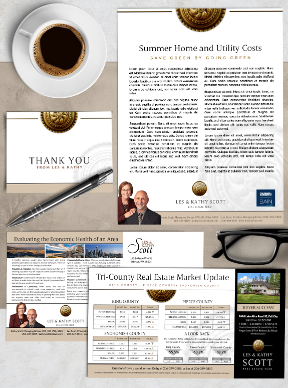
The starting point: Les and Kathy Scott had a brand designed with us several years ago, but realized it was time to freshen up their look. Their original brand was dark and luxurious, but as their business evolved, they felt the black background and simple name treatment was no longer a perfect fit. They needed a sharp and memorable logo that contained their most recognizable brand element, a decorative knob graphic, that succinctly conveyed the professional energy of their business.
The target audience: Les and Kathy are proud to represent multiple generations of buyers and sellers, which meant they needed their business to come across as both structured and contemporary, with strong familiarity.
The strategy: Design an authoritative and classic-looking logo, remove the dark background, and bring in a perfect combination of serif and sans serif fonts that can appeal to all age groups .
The final brand: To accomplish our goals, removing the dark background in the design immediately brightened up their marketing materials, giving them a refreshingly crisp and clean look. The new warm taupe color is classically comforting, and ended up being a neutral tone that helps property photos pop. And perhaps most importantly, we designed symmetrical and elegant logo that is a miniature representation brand elements they loved and used for several years. We even provided flexible versions in both square and rectangular formats to help them easily fit their logo on all digital and print marketing purposes.
To talk to a branding expert and discover how branding can make a difference in your real estate business, call us at (360) 527-8904, email [email protected].


 Posted in
  Tags:
Tags: 
