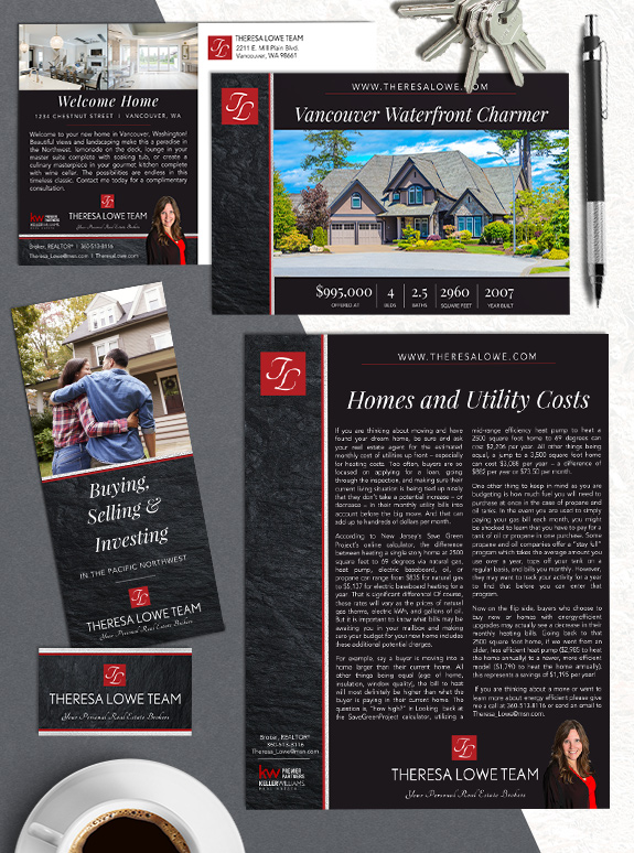
The starting point: Theresa Lowe came into the Semi-Custom Pro branding with more than two decades of experience and a stylish monogram logo. She wanted to keep her established logo and color palette to maintain her existing brand image.
The target audience: Teresa’s goal is to continue marketing her residential real estate services to the Vancouver area. She loves the proximity to Mount Hood, the Pacific Ocean, and the Columbia River.
The strategy: Teresa picked from our gallery of over 100 designs and settled on sidebar layout with clean borders. Our goal was to create a brand that could be used interchangeably for the members on her team, which meant we had to find a flexible layout for accommodating different sized names.
The final design: The square monogram stands out prominently on the textured stone sidebar, while silver foil gives each piece a touch of shimmer. The italicized serif font in her headlines adds elegance and energy, and her clean sans-serif body font makes reading easy and pleasant. The overall effect is a brand that will help her team stand out in the Vancouver market, and be remembered as a sharp and professional team.
![]()
To talk to a branding expert and discover how branding can make a difference in your real estate business, call us at (360) 527-8904, email solutions@thelonesgroup.com.
 Posted in
  Tags:
Tags: