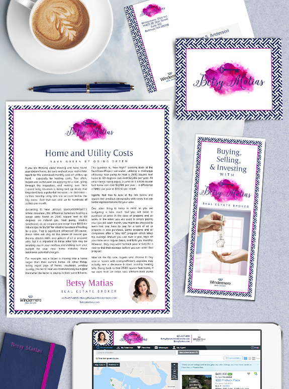
The starting point: When she started out with branding, Betsy already had her artistic watercolor logo that connected her background in art education for children with her experience and passion for real estate. Our goal was to create a bold brand that conveys the same fun energy.
The target audience: Betsy had her focus set on her Sammamish neighborhood sphere, so we needed a brand that came across as both friendly and approachable, as well as stylish and modern.
The strategy: Betsy loved the fuchsia and navy color combo right from the get-go. With such a bold palette, we knew that whitespace was essential for keeping the brand bright, open and modern. Together we found the perfect geometric pattern with the bold elements that Betsy loves, and an equal balance of color and white space.
The final brand: The most memorable part of Betsy’s brand, of course, is the logo. We love how the artistic watercolor logo stands out from the crisp geometric lines of the stylish border frame of the design. We used an understated yet fashionable font for headline, which we paired with modern sans-serif writing that will work great in print and online. The result is gorgeous, and fits Betsy’s warm and classy personality to a tee. We just love her new look!
![]()
To talk to a branding expert and discover how branding can make a difference in your real estate business, call us at (360) 527-8904, email solutions@thelonesgroup.com.
 Posted in
  Tags:
Tags: