Remember the branding “before and after” contest I announced on August 4th … and the finalists we revealed on September 1st?
Well, I’m thrilled today to declare the winner of our contest – Francine Viola!
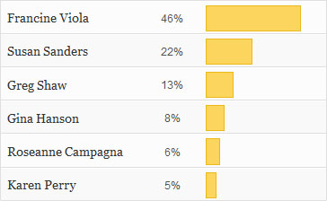
The results of our poll, as determined by our Zebra Report readers, were:
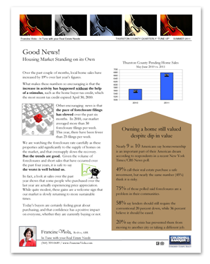
Readers really responded to Francine’s original comments, which I want to share with you again:
“Some people may equate violins and classical music to being stuffy and high-brow, but I hope people see me through my brand as someone who is knowledgeable, trustworthy, and dependable. I think that my tagline, which is a play on my last name, will defuse some of the stuffiness and let people know that I don’t take myself too seriously; they can be comfortable working with me. That is also why I also made the violas different colors.
“Communication is the most important factor for me to having a successful transaction and to building a strong client relationship. I want my tagline to express that value. I want my brand to say that I work to be “in tune” by asking my clients questions and asking them for their feedback and to say that by working together, we will meet or exceed their real estate goals. My tagline has remained the same since 2006, but the look of my marketing materials has evolved and changed over the last 5 years to what it is now.
“I like brands like the magazine, Real Simple. I like that they use big, bold photos but their logo is a simple font that they change the font colors to match the magazine cover, yet you still know the brand.
“The only comments I get on my branding is my tagline. People like that but they don’t “get” the violas. Either they don’t know that a viola is an instrument or they just can’t put my last name and the instrument together. It’s like having to explain a joke you just told! So I am always trying to improve the look to clarify what I’m trying to get across.”
Once we determined Francine’s brand was the one we would rebrand, we scheduled our first consultative design call. These calls are the first step in the creation of our custom brands, and they lay the foundation for the work that follows.
We interviewed Francine to discover more about her business, her target market, and what message she wanted to deliver with her brand. Over the last several years, Francine has relied more on print and online marketing (which has a strong visual component) rather than phone calls to keep in touch with her clients. As a result, her visual brand has become increasingly important to her.
We learned that one of Francine’s brand goals is to communicate that she has a bit of a sense of humor (by playing on her last name with her brand), but that she is also very client-focused.
Francine’s current brand ties in with her last name. For her, the other significance is that real estate is like music – there’s a structure to it, and timing is important … just as in real estate! Francine also shared her philosophy that there’s a musical score to follow, as well as a conductor, and you have to work in concert with the rest of the musicians to end up with a harmonious result.
The team determined Francine’s design style was “Classic / Artistic”. People with “classic” design styles are drawn to a blend of style and substance, and want to project an image of enduring quality. Known and appreciated for being cordial, refined, and somewhat formal, classics often appreciate and respect tradition. This is often reflected in a design that leans toward “safe” or conventional. Marketing which is simple, harmonious, and restrained feels most comfortable for Classics.
And those with “Artistic” design styles like to stand out in a crowd. Driven by aesthetics and drawn to unusual designs, Artistics believe that form is often more important than function. By nature, most Artistics think outside the box, and are willing to consider unusual ideas for their brand. Creativity and imagination fuel the Artistic’s fire.
During our design call, the creative team determined that Francine:
- Prefers light backgrounds with dark printing rather than dark backgrounds with light printing,
- Is drawn to a color palette which is a combination of blues and browns,
- Does not want a high-drama or high-contrast design,
- Likes fonts that aren’t heavy in feel, or overworked,
- Does not want purple, yellows, or overly “girly” colors in her design
- Wants to continue to use her existing tagline, “In tune with your real estate needs”
The three words Francine selected as those which would summarize her brand were loyal, intelligent, and client-focused.
Armed with the information we gathered on our initial design call, we created two internal teams to begin working on her brand. While the head of each team participated in the call, they were free to go in whatever direction they wanted in terms of design. The teams went to work, creating their visions of brands for Francine.
Earlier this week, Francine received a package from us – with the contents specially wrapped in zebra tissue paper! Inside were full-color design sample boards featuring our two initial concepts for her. What did Francine have to say upon opening the box?
“WOW! I just received the boards that you designed!
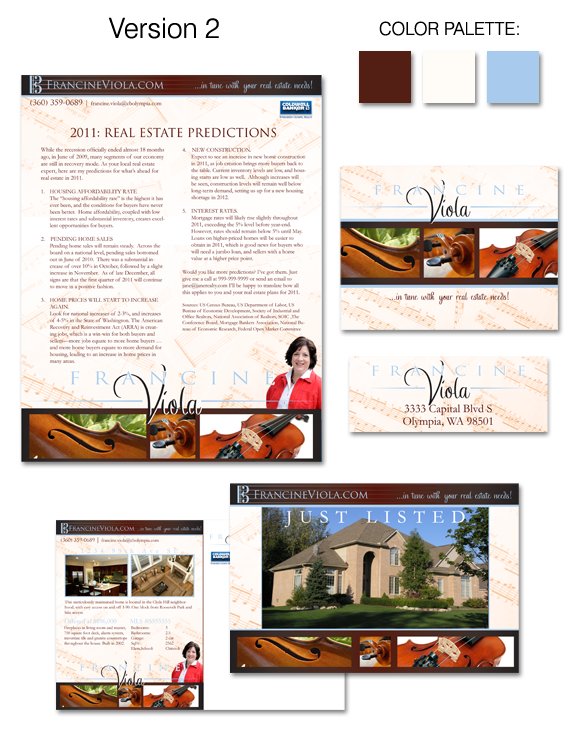
My first impression when opening the box was I was immediately drawn to Version 2 with the contrasting blues and browns. The design looks very custom and unique for me, and is bold and gets your attention. I also like the boxes of the photos and the lighter background color. I love the note card layout. This design looks classic and unique.
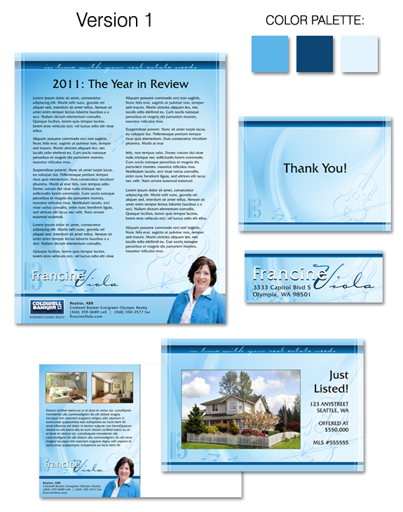
However I also have a lot of likes for the blue Version 1. I love the organization of it. It is clean, simple and more traditional in where to find my contact information. I like the drawing of the violin (but I also really like the photos of the violins!), and I like that my tag line is at the top.
I am equally impressed. Both designs are clean, I love the look of my photo being out of the box – that alone makes a huge difference – and the designs look happy, cheerful and approachable, which was something I was trying to go for.
Great job!“
Let us show you the two designs we sent to Francine …
During Francine’s follow-up call, she indicated she would like to see a combination of both designs, perhaps with the structure of the blue brand, but incorporating some of the elements of the blue/brown brand such as the contrasting colors, and the image of the viola. She also liked her tagline at the top of the piece. However, she felt the header and footer on the blue/brown design needed to be scaled back a bit, and that the font wasn’t quite perfect. I agreed incorporating pieces from both design, as well as Francine’s recommendations, would result in a good solution and took the best of both designs into account.
If this contest was following our standard process, at this point we would be scheduling additional calls with Francine, incorporating her feedback, and working collaboratively with her to make revisions to her brand until it’s absolutely perfect for her!
It was so exciting for us to rebrand Francine, and we love the ideas we came up with for her. More importantly – so does she! I want to offer a thank-you to everyone who participated in the voting for our “branding before and after” contest. We hope you enjoyed following along, and that you are thinking about developing your own personal brand.


 Posted in
  Tags:
Tags: 

Congratulations! Love the look!
Thanks Roseanne – we love it too! Denise