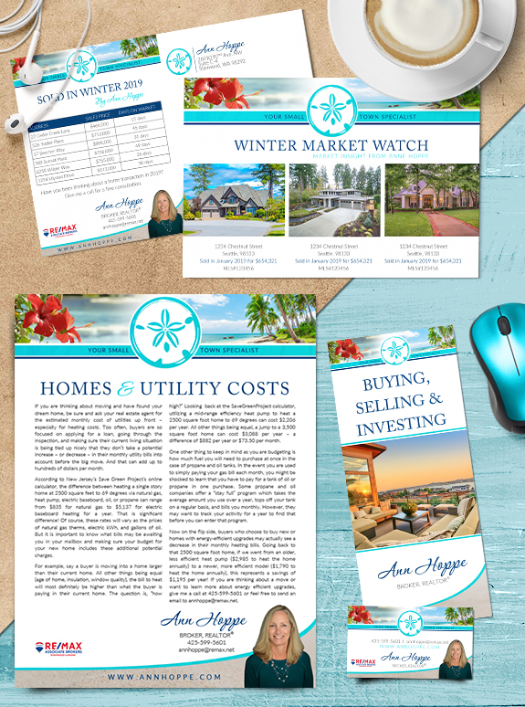
Ann Hoppe naturally has a sunny disposition, and she wanted her Semi-Custom PRO brand to reflect that. Tropical blues paired with warm sand textures create a brand that is attractive and delightful to the eye. An elegant script font adds a personal touch to her name, while a strong all-caps serif makes her headlines easy to read. The sand dollar emblem and curved footer emphasize her connection to the ocean. Her new brand is sure to make a splash in her small-town market! To learn how branding can make a difference in your real estate business, call us at (360) 527-8904, email solutions@thelonesgroup.com, or learn more:


 Posted in
  Tags:
Tags: 
