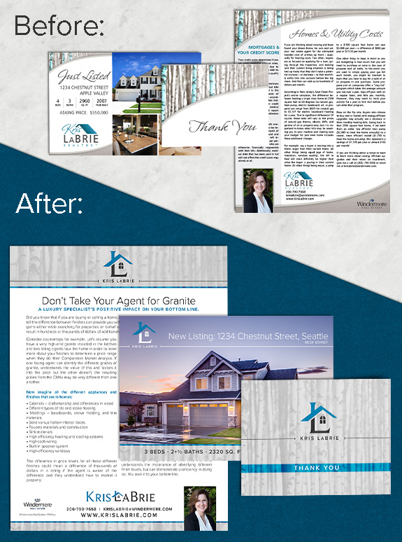
The starting point: Kris LaBrie is a Mastery graduate, and has been using her brand for several years now. A year after Windermere refreshed their company branding, Kris decided she needed something a little brighter and fresher to match. She especially wanted a stand-alone logo to help her marketing in areas that were not traditional print.
The target audience: She has already made a splash with her clients, and she needed to keep some brand equity to avoid confusion. She works with a variety of buyers, sellers, and investors, and wanted something modern that popped off the page to get their attention.
The strategy: We started with stripping the color palette and font selections to the bare bones–which resulted in a neutral-gray palette with a pop of blue, and just one font used throughout the design. Through a couple of variations, we settled the birch photo as the most important element to carry into the new design. Then we designed a monogram logo divided by a roof line to crown her new branding.
The final design: Minimal and light, Kris’s new branding is easier than ever to work with. As she moves forward into a new decade, her new marketing aesthetic is sure to inspire.
To talk to a branding expert and discover how branding can make a difference in your real estate business, call us at (360) 527-8904, email solutions@thelonesgroup.com.


 Posted in
  Tags:
Tags: 
