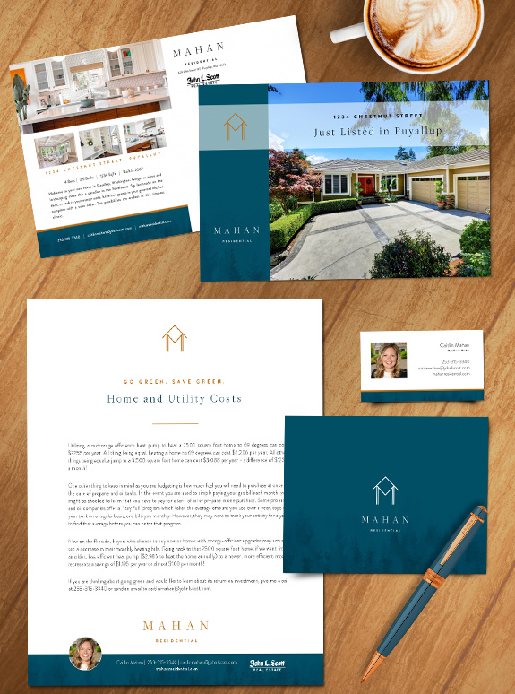
The starting point: Top producer Jerry Mahan is teaming up with his daughter Caitlin to reconnect with a broad range of clients from his career in real estate.
The target audience: For several decades, Jerry worked as the agent in many new-construction neighborhoods. Now he and Caitlin will go back to those neighborhoods and become known as the specialists they are. Their branding needed to be modern and approachable to aid their marketing outreach and appeal to the step-upper demographic.
The strategy: The new brand is intended to introduce Caitlin as the new face of the Mahan residential real estate business. We worked with Caitlin to build the name The brand needed to be ultra-clean with a strong and minimal logo design. The color palette needed to be bold and attention-grabbing to provide contrast against the whitespace, and finally, we needed to tie in their love of Pacific Northwest Nature.
The final brand: Their logo combines an “M” monogram with craftsman-styled entryway. We used a deep marine color paired with an rich amber hue to make their brand stand out. The layouts feature crisp lines and abundant whitespace that work together to provide a refreshingly sleek impression.
To talk to a branding expert and discover how branding can make a difference in your real estate business, call us at (360) 527-8904, email solutions@thelonesgroup.com.


 Posted in
  Tags:
Tags: 
