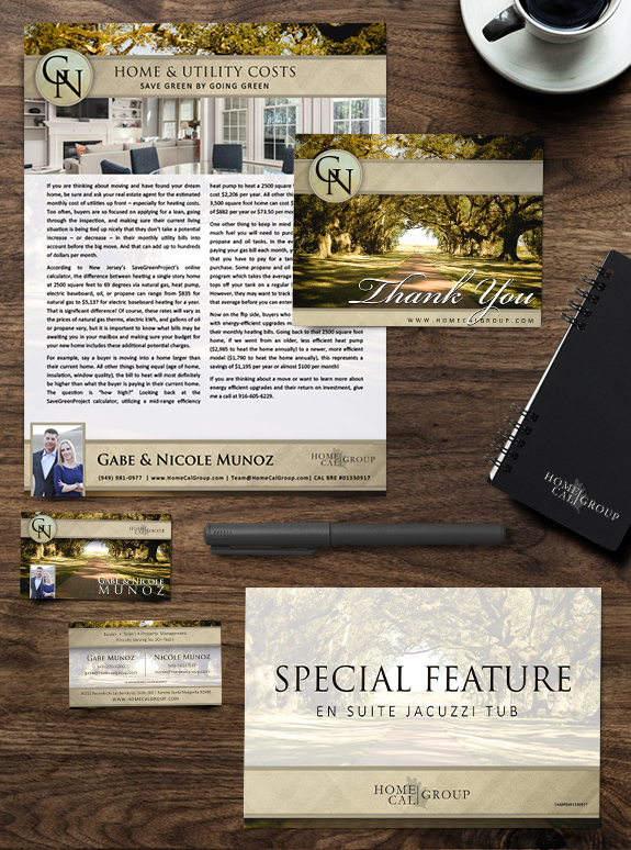
MASTERY clients Gabe and Nicole, owners of HomeCal Group brokerage and property management company in Southern California, are a great example of how effective a driven go-getter team can be. Their brand consists of a filtered southern California pathway flanked by local oak trees, with sand colors and bold, elegant fonts. During their time in […]
Posts Tagged ‘script’
Branding Spotlight: Marie Strong
One of our branding super-stars, Marie Strong has a bold and classic brand that accentuates her passion for working with and preserving historical homes. From her classic font selection to the tone-on-tone pattern in the background, her brand balances vintage aesthetic with modern utility and strength. An understated structure, with slim header and footer bars, […]
Branding Spotlight: Cindy Clark
Whatcom local Cindy Clark has an understated and eclectic brand style, and wanted marketing templates that would convey her passion for serving. Cindy loved the combination of a rich blue with a fresh, cheerful orange to convey her warm, approachable nature. Her ornate logo is repeated in a subtle tone-on-tone pattern inside the strong and […]
Branding Spotlight: Julie Clarke
This week’s branding spotlight features the design of Mastery client Julie Clarke from Germantown, Wisconsin. Julie needed a brand that would match her flair for fun and her dedication to her clients. She embraced her favorite color–pink!–and paired it with navy and a pearly bokeh texture to keep it mature and sophisticated. The monogram seal-style […]
Branding Spotlight: Kim Schaaf
This week’s branding spotlight features the design of Mastery agent Kim Schaaf, from Bothell, Washington. Kim needed a brand that matched her reputation as the “bubble” lady, and wanted to feature bubbles in her brand. Each bubble also contains the reflection of a yellow rose, Kim’s favorite flower. Even her logo looks like a popping […]
Branding Spotlight: Kari Zimmerman
This week’s branding spotlight features the design of Mastery agent Kari Zimmerman, from Seattle, Washington. Kari’s passion for music, travel, and color inspired her design with vivid pinks and oranges framing a sunrise over Seattle. Her monogram logo pairs perfectly with her round portrait frame and produces diagonal balance. The music notes on her notecard […]
Branding Spotlight: Angie Vezina
This week’s branding spotlight features the design of Mastery agent Angie Vezina, from Bellevue, Washington. Angie dreamed of a brand that incorporates her love of sunsets, bold bright colors and water, so we created a brand that features a brilliant beach sunset, framed in a white curve and faded into the background. Her brand was […]