serif | The Zebra Blog

Posts Tagged ‘serif’

Branding Spotlight: Domenica Lovaglia

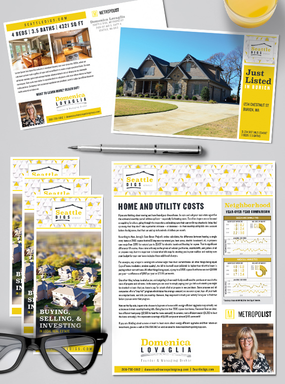
The starting point: Ever the innovator and entrepreneur, Domenica wanted a brand for her Seattle Digs boutique real estate service, under the umbrella of the brokerage she took part in founding, Metropolist. She selected a Semi-Custom PRO package to give Seattle Digs the boost it needed. The target audience: Domenica has worked in the Seattle […]

Branding Spotlight: Dorothy Driver

The starting point: Dorothy loves color and wanted to include all of her favorite hues in her Mastery brand. She also wanted to use dots as a major branding element, as she built brand equity with dot-patterns before. However, the final brand also needed to work well for her business partner Don and incorporate their […]

Branding Spotlight: Veronique Hval

The starting point: We first built a brand for Veronique and her business called “Belle Residence” in 2014. We worked with her to achieve a look that incorporates her French background and elegant style. Early last year, she returned for a brand refresh that would simplify her existing brand to create a minimal, sleek look. […]

Branding Spotlight: Theresa Lowe

The starting point: Theresa Lowe came into the Semi-Custom Pro branding with more than two decades of experience and a stylish monogram logo. She wanted to keep her established logo and color palette to maintain her existing brand image. The target audience: Teresa’s goal is to continue marketing her residential real estate services to the […]

Branding Spotlight: Kerryn Lyons

Kerryn Lyon’s new fashionable navy and gold branding is simple in design and rich in color. Her luxurious gold logo and matching gold border define the design. We used a bold and modern font combination for her marketing materials, and a lively brush script for her signature. Kerryn is a joy to talk to, and […]

Branding Spotlight: Kathy Madsen & Mary Nelson

Kathy and Mary wanted a design that was cutting edge but still classic. Both love the emotional power of luxurious black-and-white photography, and so their brand includes a filmstrip of lifestyle photos in the header. The overall palette of pale taupe and charcoal grey keep the design warm, but let the content and property photos […]

Branding Spotlight: Deborah Young

Deborah’s elegant and dramatic design style demanded a brand that would help her stand out in the luxury home market. Her spectacular wrought-iron gate logo ties the brand together, opening her business to new possibilities. Strong chocolate hues lend warmth and strength, while a pop of light aqua lightens and refreshes the page. Gentle tone-on-tone […]

Awesome, timely advice for real estate agents. Delivered weekly.
  • Fresh trends
  • Best practices
  • Research and statistics

Enter your email and stay on top of things,


Subscribe!