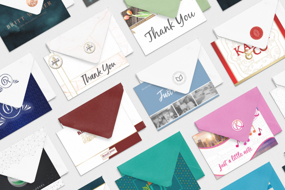
Make every note extra special without a lot of extra work simply by getting a batch of branded notecards printed. Modern digital printing gives us so many options for a creative and professional look, with different papers, gloss/satin/velvet finishes, and even foil embossing. Whether it’s an all-purpose notecard with your name or logo on the […]
Posts Tagged ‘color’
Does Your Business Need a Visual Disruption?
We have a new employee at The Lones Group this week (welcome, Izabella!) and with it came the usual reconfiguring of desks and equipment. The plan is in place and by the end of the week, furniture will be moved, vacuuming of baseboards and spaces behind desks will happen, people will move around and starting […]
11 Secrets to Geo Farming Success
Many real estate agents utilize geographical farming to build a strong predictable lead generation system. It is easy to send postcards to your farm and call it good but is that getting you the results you want? If not, then it is time to make some tweaks to build a strong PERSONAL PRESENCE. When I […]
Ask Denise: Considering Colors
Q: “Denise, I have a brand that I have been using for a few years. I had aligned my color palette with my company’s but I am moving companies and am not sure what to do. Do I adjust my color palette to match my new company? Stick with what I’ve got? Or adjust to […]
Design Spotlight: The Paul Team
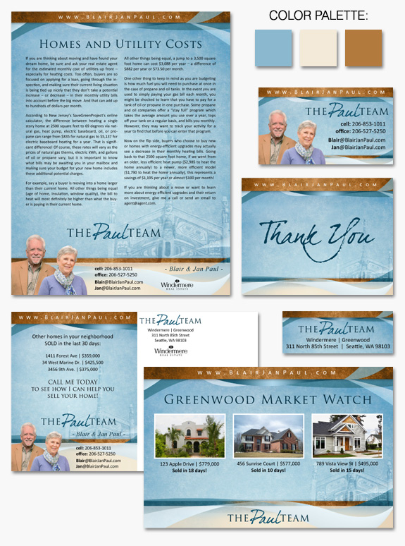
This week’s design spotlight features one of our MASTERY branding client duos, The Paul Team. Blair and Jan Paul came to us wanting a cohesive branding design that would stay true to their roots and give their marketing materials a professional polish. In the Paul’s brand we combined elements from several different Instant Identity templates, […]
Design Spotlight: Damon & Licica Benefield
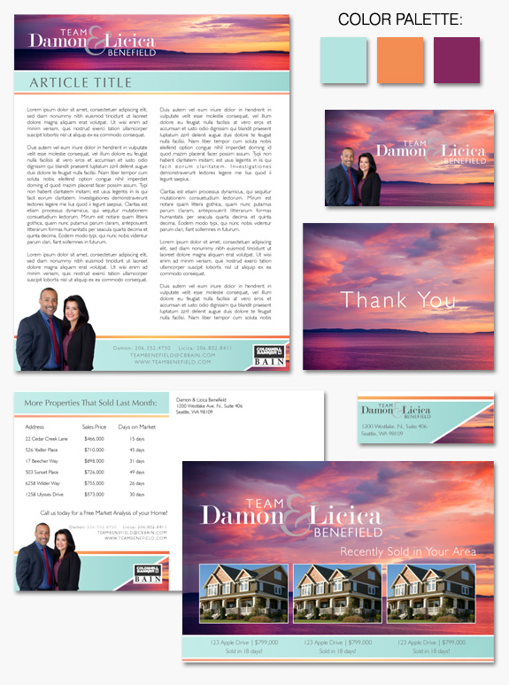
This week’s design spotlight features one of our MASTERY branding client duos, Team Benefield. Licica and Damon Benefield came to us wanting a cohesive branding design that would set them apart and make a lasting impression. They wanted a design that would appeal to a wide range of demographics, both young millennials and older generations. […]
Design Spotlight: Flower Power
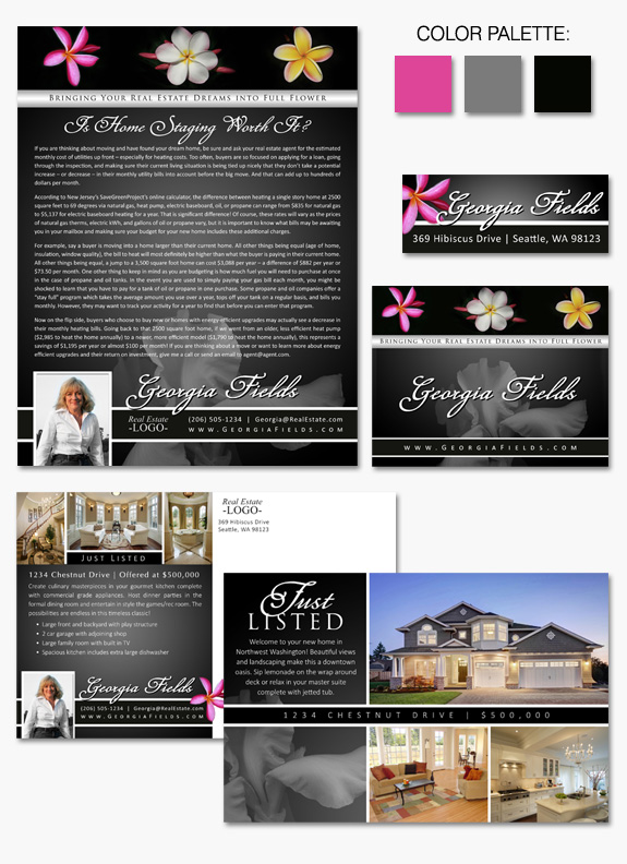
This week’s design spotlight features the newly refreshed Instant Identity branding design, “Flower Power.” Though the name may conjure groovy images from the sixties, this brand uses elegance and sophistication to convey the impact a beautiful flower can give. Brightly hued tropical flowers take center stage at the top of the page to draw your […]
Design Spotlight: Firebrand
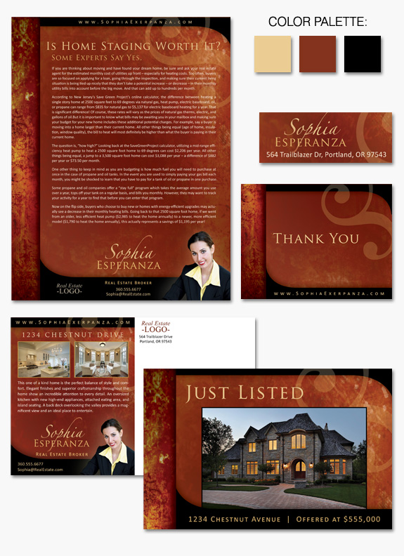
This week’s design spotlight features our newly refreshed Instant Identity branding design, “Firebrand.” Fiery reds and golds shimmer and swirl across the page creating sumptuous textures and patterns. Inky black curves contrast dramatically against the bold, flame colored background. Strong, classic, and elegant fonts complete the picture, alongside a transparent, abstract swirling element. This brand […]
Design Spotlight: Seal of Approval
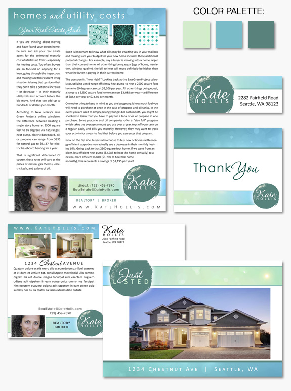
This week’s design spotlight features our newest Instant Identity branding design, “Seal of Approval.” This brand is a contemporary take on a classic format. Crisp white backgrounds contrast with bright colored hues of lime green, teal, and robin’s egg blue. A bold, dark teal abstract “seal” gives a distinctive mark that serves as both a […]
Design Spotlight: Trim Mint
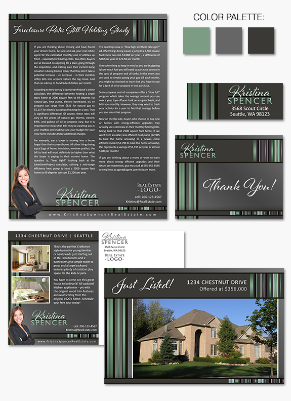
This week’s design spotlight features the “brand new” Instant Identity design, “Trim Mint.” Sleek black and mint green lines frame and add visual interest to the gray toned, angle-gradient background. Distinct and creative fonts and a fresh, contemporary – yet timeless – color palette make this a branding design that lets your content take center […]